
The best of the best of the best
Enigmatic images, pithy titles, great covers: We here present a choice selection from the English issues of Horizons.

“A moment when Horizons turned towards more modern photography” is how picture editor Lisa Schneider describes this macro-shot of the inner workings of a watch. | Photo: Patek Philippe
The English version of Horizons was introduced in 2014 to mark the 100th issue. It was only ever printed once – in March 2016 – and sought to gauge interest in a regular hardcopy of the magazine in the most commonly used language for science publications. At that time, it was otherwise available in electronic (pdf) format only. It later went online at horizons-mag.ch along with the other language versions.
Best titles
They are all individual in their own way, and perfect fits!
Net, bugs and rock ’n’ roll
Horizons 108 (2016) featured a biologist with a rich background: epidemiologist, computer programmer, rock concert performer, internet art dealer… Not only did the title fit back then, but it also fits now: illustrating how Horizons has come to embrace the scientist behind the science.
Fly away Peter – stay awhile, Pauline
By changing ‘Paul’ to ‘Pauline’, this neat modernisation of the nursery rhyme for an article on bird migration in Horizons 121 (2019) embodies the move to inclusive language.
Anna is Anna is Anna is Anna
From the poetry of 1913 – “A rose is a rose is a rose is a rose” – to facial recognition technology in Horizons 126 (2020), one thing hasn’t lost value: the importance of being exactly who or what one claims to be, after ‘Sacred Emily’ by Gertrude Stein.
“How pretty something can be that would otherwise repel me!”
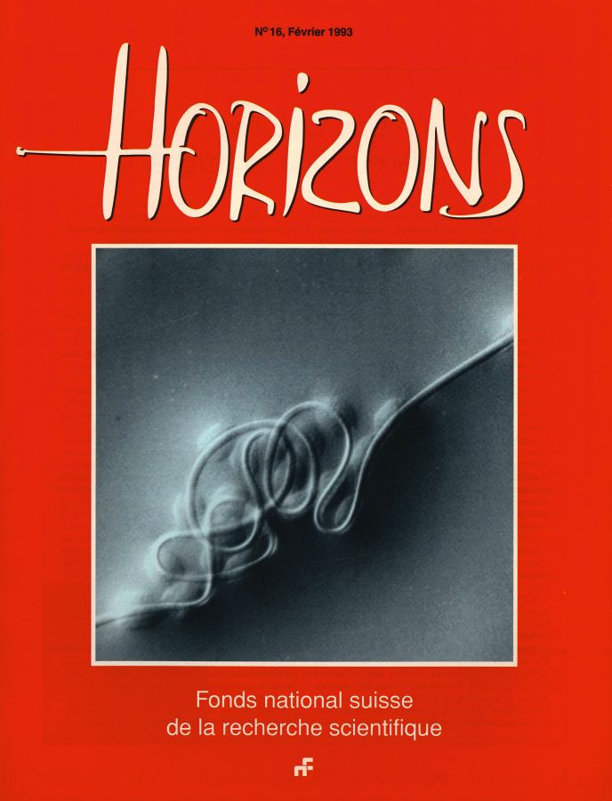
This is Judith Hochstrasser’s assessment of an image of a tangled spider’s web covered in water droplets, magnified 1,500 times under an electron microscope, that featured in the 16th issue of Horizons back in 1993. Her co-editor Florian Fisch also finds it convincing: “To me, those covers are the most beautiful where I don’t quite understand what I’m seeing, while my best guess is probably not entirely off the mark”.
“The feasible trumps the useful”
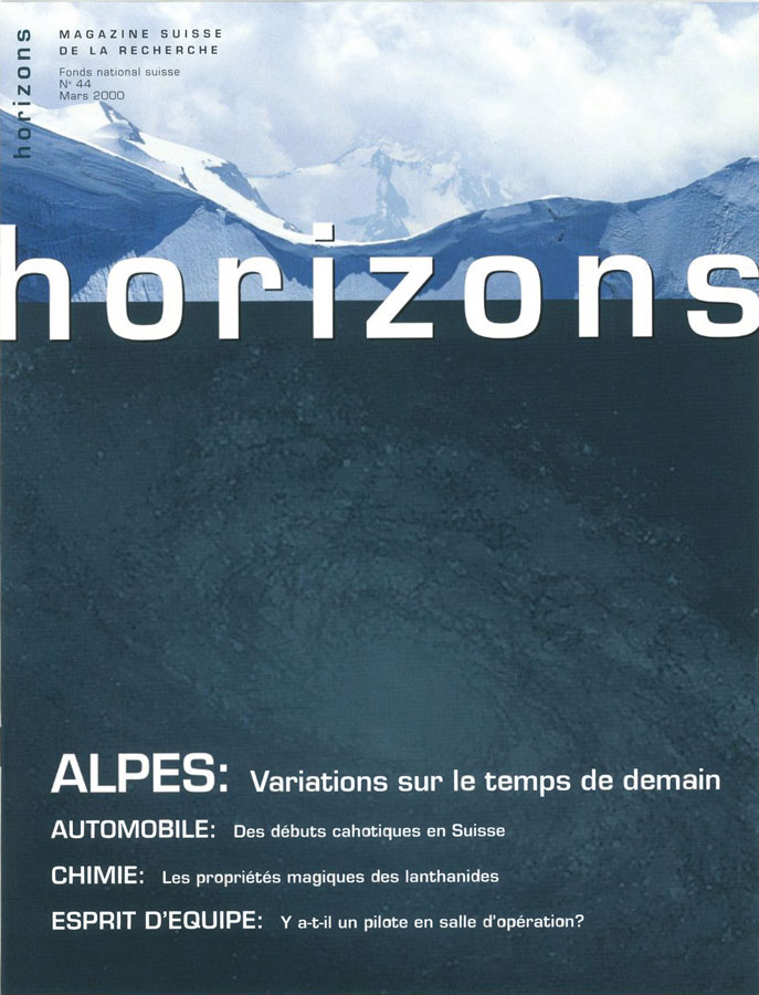
“That’s just so noughties”, says Tobias Peier about this cover. He’s the joint head of Bodara, the graphic design agency responsible for Horizons since 2020. This cover, from the period between 1998 and 2012, features two different images. “The line at the top separates what’s diffuse from what’s concrete”, says Peier. “It’s actually a fitting symbol, though these covers often leave me at a loss as to what the content is actually about”.
“It shows the courage to embrace change”
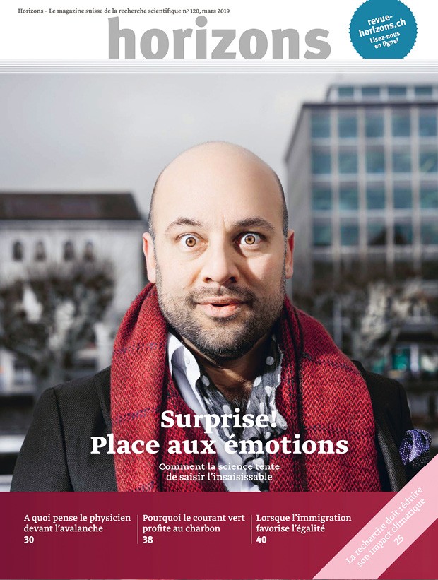
Lisa Schneider is picture editor at Horizons, and her favourite cover comes from the Magazine’s third design series. “This was the first photo portrait on a cover of Horizons”, she says, “and it marked a new chapter in the history of the magazine. Its composition succeeds in surprising the reader. It’s immediately eye-catching and makes you curious about the cover story”.
Questionable titles
Rather than describe, they may distract from the topic at hand
The senile were once young too
At the time of Horizons 102 (2014), ‘senile’ was still a catch-all term. Today, as with many such labels, it’s lost its currency, as we increase our awareness and understanding of dementia and all of its multiple forms and causes.
Brother Sun and Sister Coal
Referencing ‘The Canticle of the Sun’ by Saint Francis of Assisi, this personification of energy sources in Horizons 120 (2019) places a male as clean green energy and a female as dirty fossil fuel. It’s interesting nonetheless to see how ‘fire’, ‘sun’, ‘water’, ‘wind’ and the ‘moon’ map onto energy sources: fossil, solar, wind, hydro and tidal.
Ukraine: a land searching for itself
Whilst the September 2016 cover title – ‘Ukraine: the identity of a nation’ – probably still works in 2026, this variation from the contents page was perhaps already an anachronistic understatement at the time: some two years after the annexation of Crimea. ‘Searching’? No. ‘Fighting’. Yes.
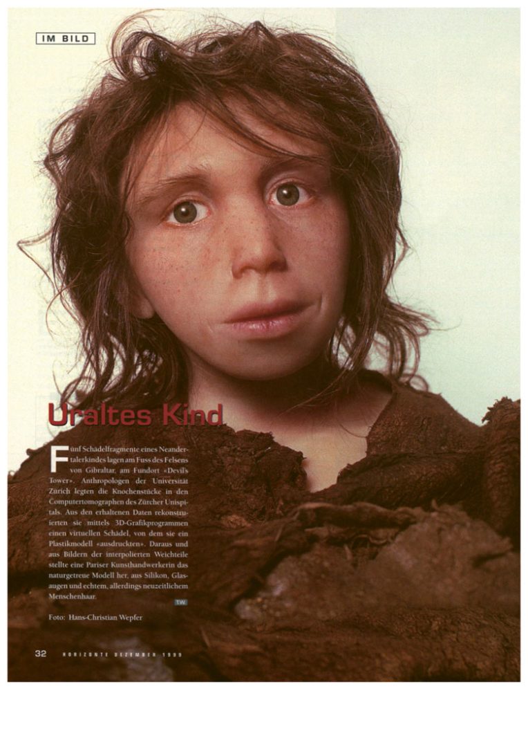
“I’ve been wondering how it was made. Was it with a computer? Is it a photo of a doll? These days, it would probably be made by AI”. This model of a Neanderthal child is the favourite image of Horizon’s picture editor Lisa Schneider. It was created in 1999 by researchers working together with a craftswoman. | Image: Hans-Christian Wepfer
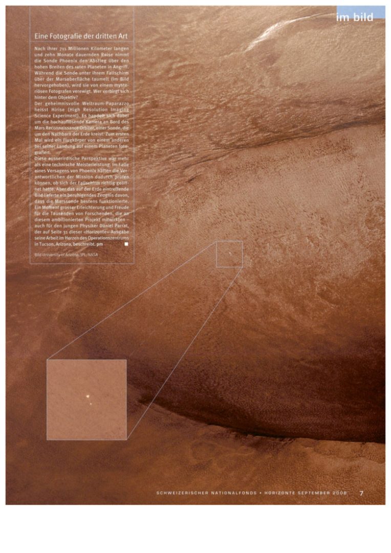
“First I see a landscape of skin – perhaps the fine details of a scar, and only then do I grasp the scale of it, which is crazily confusing!”. Helene Leuzinger, a graphic designer, is especially fond of this image from 2008 of Mars and the Phoenix lander, taken from space. | Image: University of Arizona/JPL/Nasa
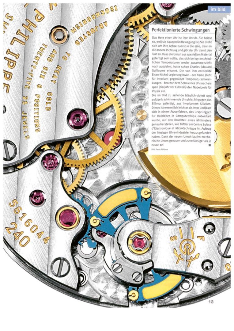
In 2012, Swiss researchers devised a high-precision balance wheel using silicon. The quality of the image is also exquisite. “It was a moment when Horizons turned towards more modern photography”, says Schneider. | Image: Patek Philippe
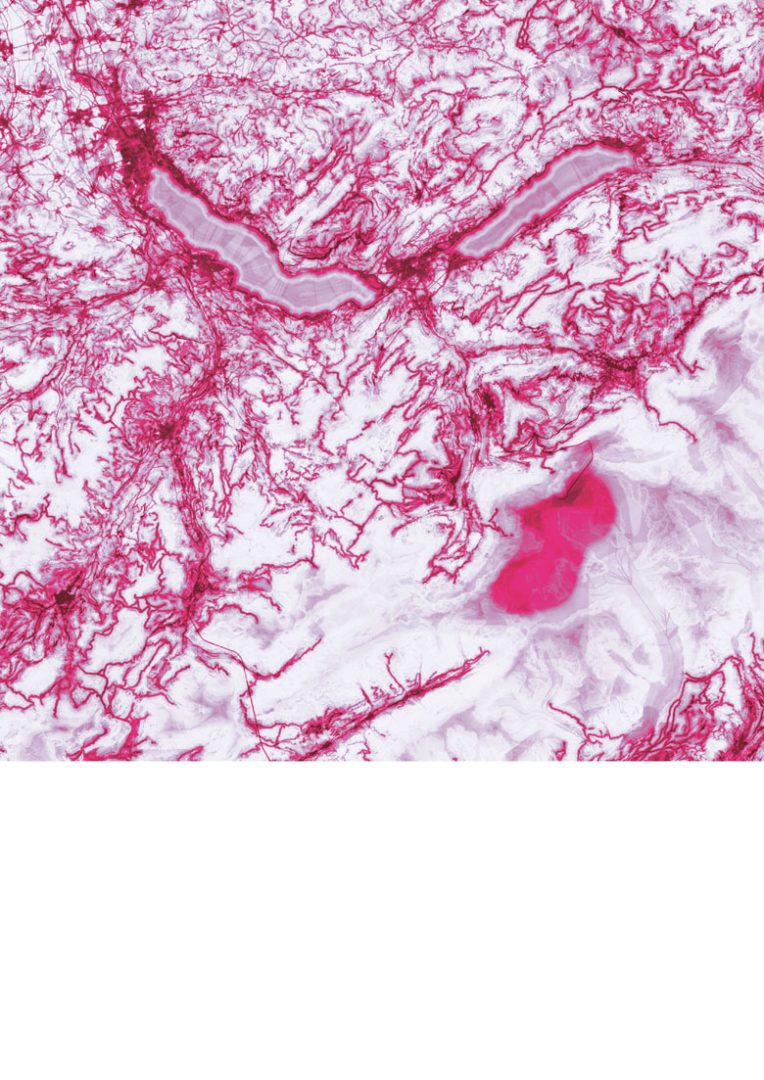
Near Interlaken and the Jungfraujoch, people take photos of Nature. The deeper the shade of pink in the sky, the more often they take pictures of it. This image from 2024 combines geolocation data and AI. It’s a testament to contemporary crazes in photography.
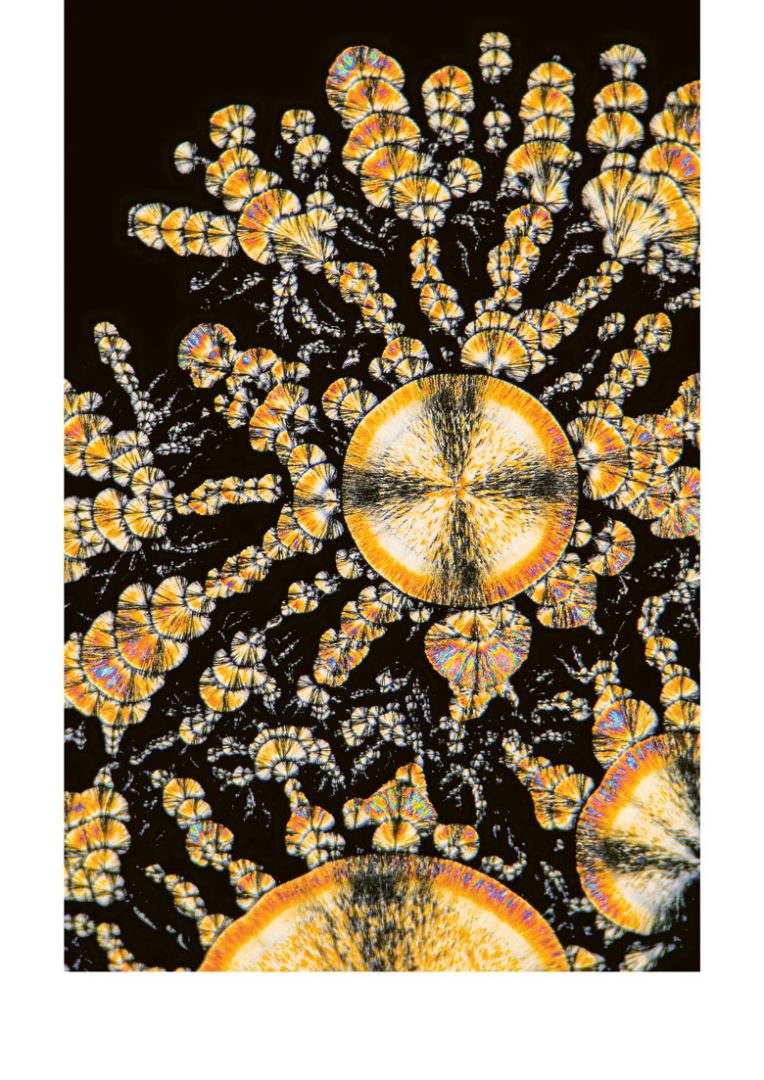
Since the SNSF Scientific Image Competition was launched in 2017, many photos submitted to it have appeared in issues of Horizons. Leuzinger’s especially enthusiastic about this one: “This microscopic beauty in all its complexity – I could never have imagined that vitamin C could look like this”. | Image: David Kubon
Bizarre titles
There’s a lot to choose from. Here’s some of our favourites
The meaning of vomit
It‘s not what you think. The keyword in this article from Horizons 124 (2020) is actually ‘meaning’, as ants communicate using ‘trophallaxis’ as other social insects such as bees or wasps.
Sensitive bankers
Psychological sensitivity? Gut feeling? This contents pages title from Horizons 111 (2016) conflates traders and bankers to attract readers’ attention.
Blessed are the cheesemakers
Nothing mediaeval in this ‘How does it work’ from Horizons 114 (2017), which describes how to reduce heavy metal contamination of water using cheap proteins in whey. Another story about holy cheese in Switzerland?